Visualizing-With-Hadi
| home page | data viz examples | critique by design | final project I | final project II | final project III |
Final Project – Part I
Has Modern Music Lost Its Emotional Range?
Outline
According to IFPI’s Engaging with Music report, the average person spent 20.7 hours per week listening to music in 2023 (IFPI, 2023). For many of us, including me, that number is probably even higher. I easily cross that weekly average. Music is now a constant companion: in commutes, study sessions, workouts, and background noise while we work. If music is such a big part of our emotional lives, then the kind of emotions it carries really matters.
This project asks a simple but important question:
Is popular music becoming emotionally homogeneous over time?
Using large-scale Spotify audio features, I will explore whether the emotional range of tracks has tightened around a “safe” middle. I will look at how valence (happy–sad), energy, loudness, and related features behave across time, genres, and languages to see whether modern music is converging toward a narrower emotional band.
Story structure
1. Hook – We listen more than ever
Set the stage with the global listening statistic and a short personal note about my own listening habits. Introduce the central question: if we are surrounded by music, is that music still emotionally diverse?
2. Question – Is there an emotional “middle” now?
Explain valence, energy, and a few key audio features in plain language. Introduce the idea of emotional convergence: instead of very happy or very sad songs, we might increasingly get “medium mood” songs.
3. Trends over time – How emotion spreads have changed
Use line charts and distribution plots (by year or decade) to show how the spread of valence, energy, and loudness changes over time. Focus on whether the variance or range is shrinking.
4. Genres – Who is converging the fastest?
Compare genres using boxplots, density plots, or radar charts. Look at whether certain genres (for example, electronic or pop-adjacent genres) are more emotionally homogeneous than others (for example, acoustic or singer–songwriter genres).
5. Languages – Do cultures feel different in sound?
Use the multilingual dataset to compare emotional distributions by language (English, Hindi, Tamil, Telugu, Malayalam, Korean). Show whether some languages preserve wider emotional variation than others, or whether global pop trends are pulling everything toward similar moods.
6. Emotional outliers – The songs that still “feel a lot”
Highlight rare tracks that have extreme valence (very joyful or very dark), and see what other features they share (tempo, acousticness, speechiness, etc.). Ask: are these outliers getting rarer?
7. Conclusion – Why emotional range in music matters
Wrap up with what these patterns could mean for creativity, listeners’ emotional experiences, and how recommendation algorithms might be shaping what we hear. End with a takeaway that connects back to the audience: if our playlists feel more similar, it might not just be in our heads.
Initial Sketches
Below are my initial planned sketches, each aligned with the story structure and the questions guiding my project. These sketches serve as early visual thinking — they are not final charts but conceptual layouts that illustrate how I intend to communicate the narrative of emotional change in modern music.
Sketch 1 — Weekly Listening Time
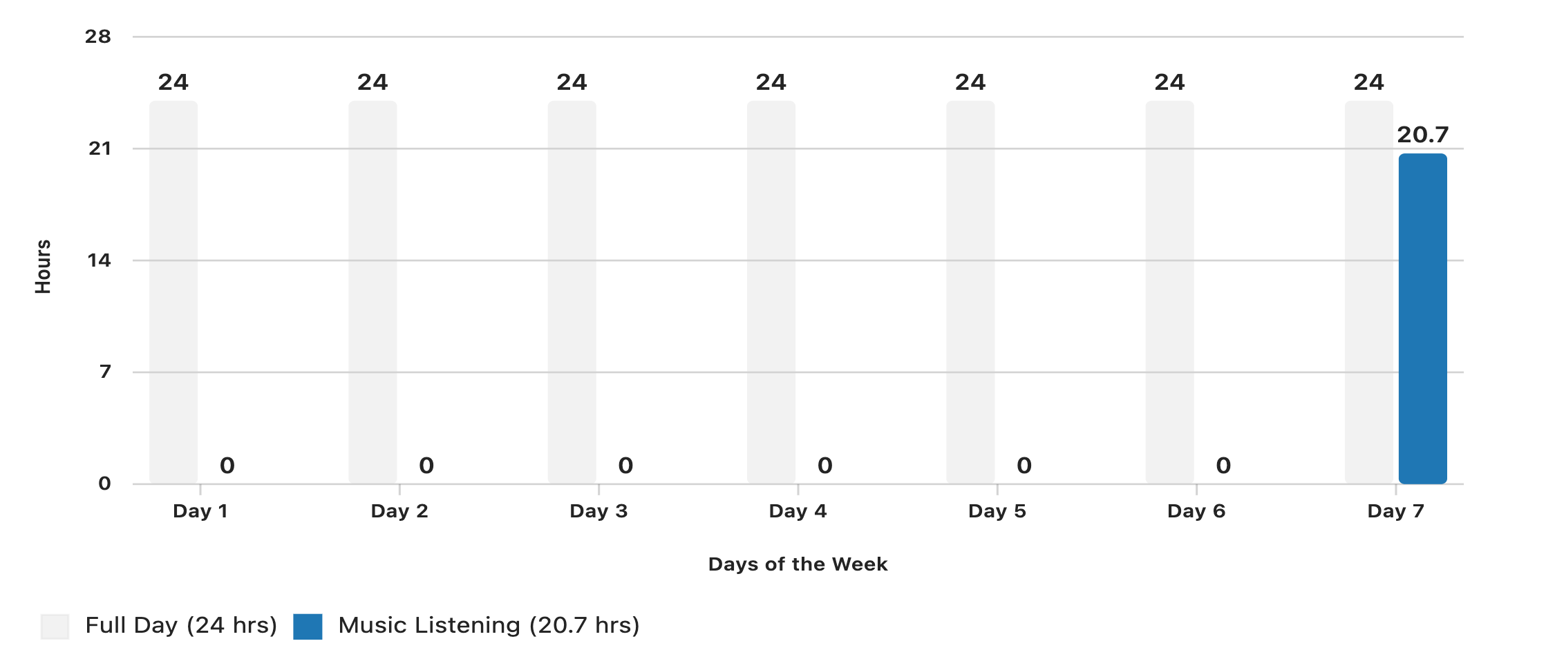
This makes it visually clear that the 20.7 hours people spend listening to music per week is almost equivalent to a full 24-hour day.
Sketch 2 — Shrinking Emotional Range Over Time
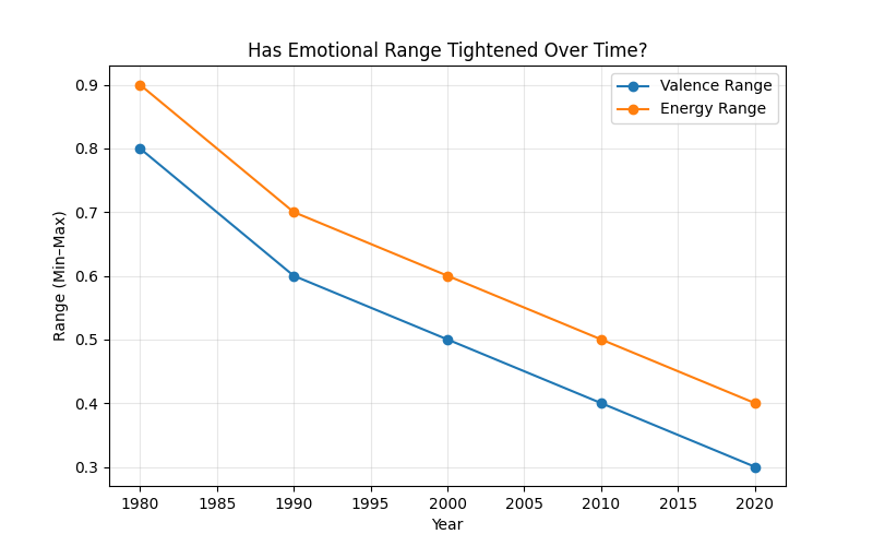
A conceptual bar-range sketch showing the min–max spread of valence and energy across decades (1980–2024).
This introduces the central question: Has music become emotionally narrower over time?
Sketch 3 — Old vs. New Emotional Distributions
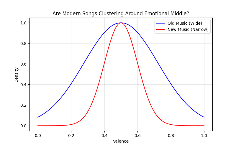
A pair of distribution sketches:
- Older music → wide, varied emotional curve
- Modern music → tight clustering around the center
This visually argues that emotional diversity may be declining.
Sketch 4 — Emotional Range Across Languages
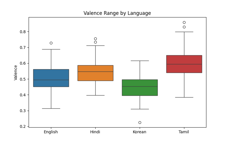
Boxplots comparing valence across six languages:
English, Hindi, Tamil, Telugu, Malayalam, and Korean.
This helps examine whether emotional narrowing is:
- a global phenomenon, or
- varies culturally.
Sketch 5 — Genres Losing Emotional Contrast
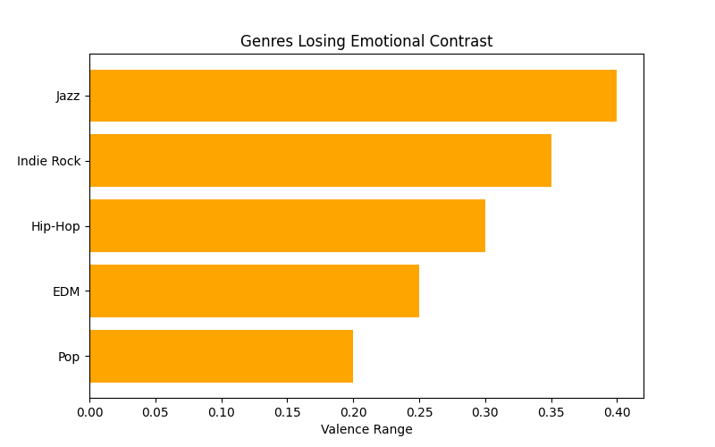
Bar-range sketches for genres like Pop and Commercial Dance, showing reduced valence range.
These genres appear the most “algorithmically compressed.”
Sketch 6 — Genres With Wide Emotional Expression
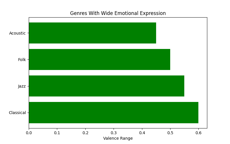
Parallel to Sketch 5, this concept shows genres with broader emotional palettes, such as:
- Acoustic
- Classical-influenced genres
These sketches provide contrast: not all genres are homogenizing equally.
Sketch 7 — Emotional Fingerprints
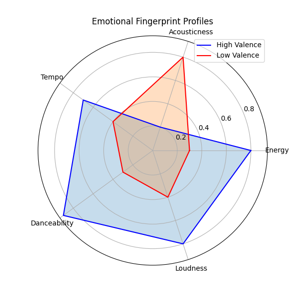
Radar-style mockups showing how high-valence and low-valence songs differ in:
- acousticness
- loudness
- danceability
This addresses the question: When emotional extremes still exist, what makes them unique?
These sketches collectively support my narrative arc — beginning with why music matters, showing emotional narrowing across time, comparing genres and languages, and ending with the unique “fingerprints” of emotional outliers.
The data
I am using one single dataset that already includes:
- 60,000+ Spotify tracks
- 6 languages
- full audio-feature metadata
- release year
- track popularity
- genre
- acoustic/emotional features
Dataset: Spotify Multilingual Tracks (Updated Weekly)
Source: Kaggle
URL: https://www.kaggle.com/datasets/gauthamvijayaraj/spotify-tracks-dataset-updated-every-week
Key variables I will use
yearlanguagevalenceenergyloudnessacousticnessdanceabilityspeechinesstrack_genrepopularity
How I will use the data
I will:
- Clean and standardize the dataset (handle -1 values, clean genres, ensure year ranges are valid)
- Group songs by year, genre, and language
- Compute emotional spread measures:
- Variance / IQR of valence
- Variance / IQR of energy
- Combined “emotional spread index”
- Identify and count outlier tracks (top/bottom 5% valence)
- Compare trends across time, genre, and language
- Create summary datasets for Tableau
- Build final story narrative in Shorthand
This single dataset fully supports the global + multilingual + emotional comparison story.
Dataset link
| Name | URL | Description |
|---|---|---|
| Spotify Multilingual Tracks Dataset | https://www.kaggle.com/datasets/gauthamvijayaraj/spotify-tracks-dataset-updated-every-week | Primary dataset (60k+ tracks, 6 languages, full audio features) |
| IFPI “Engaging with Music” 2023 | https://www.ifpi.org/ifpis-global-study-finds-were-listening-to-more-music-in-more-ways-than-ever | Source for the 20.7 hours/week global listening statistic |
Method and medium
I will create my final project as an interactive, standalone digital story. My project will use Shorthand as the primary storytelling platform. Shorthand’s scroll-based format allows me to combine narrative text, images, and embedded data visualizations in a way that feels cohesive and immersive. All visualizations — such as temporal trends, genre comparisons, and emotional-range distributions — will be created in Tableau, exported as interactive dashboards, and embedded directly into the Shorthand story.
Data cleaning, preprocessing, and exploratory analysis will be done in Python, ensuring the dataset is structured appropriately for Tableau. I will not use PowerPoint or Excel for the final deliverable.
References
- IFPI. (2023). Engaging with music: Global report 2023. International Federation of the Phonographic Industry. https://www.ifpi.org/ifpis-global-study-finds-were-listening-to-more-music-in-more-ways-than-ever
- Vijayaraj, G. (n.d.). Spotify tracks dataset (updated every week). Kaggle. https://www.kaggle.com/datasets/gauthamvijayaraj/spotify-tracks-dataset-updated-every-week
AI acknowledgements
I used ChatGPT to brainstorm project ideas, refine the story framing, and format the written portions of this page. I have also used AI for generating initial sketches (story layout mockups, visualization layout drafts, and storyboard-style panels). These sketches will are guided by prompts I write and serving only as planning references; all final visualizations and narrative structure will be created by me.